

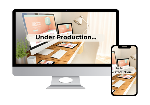

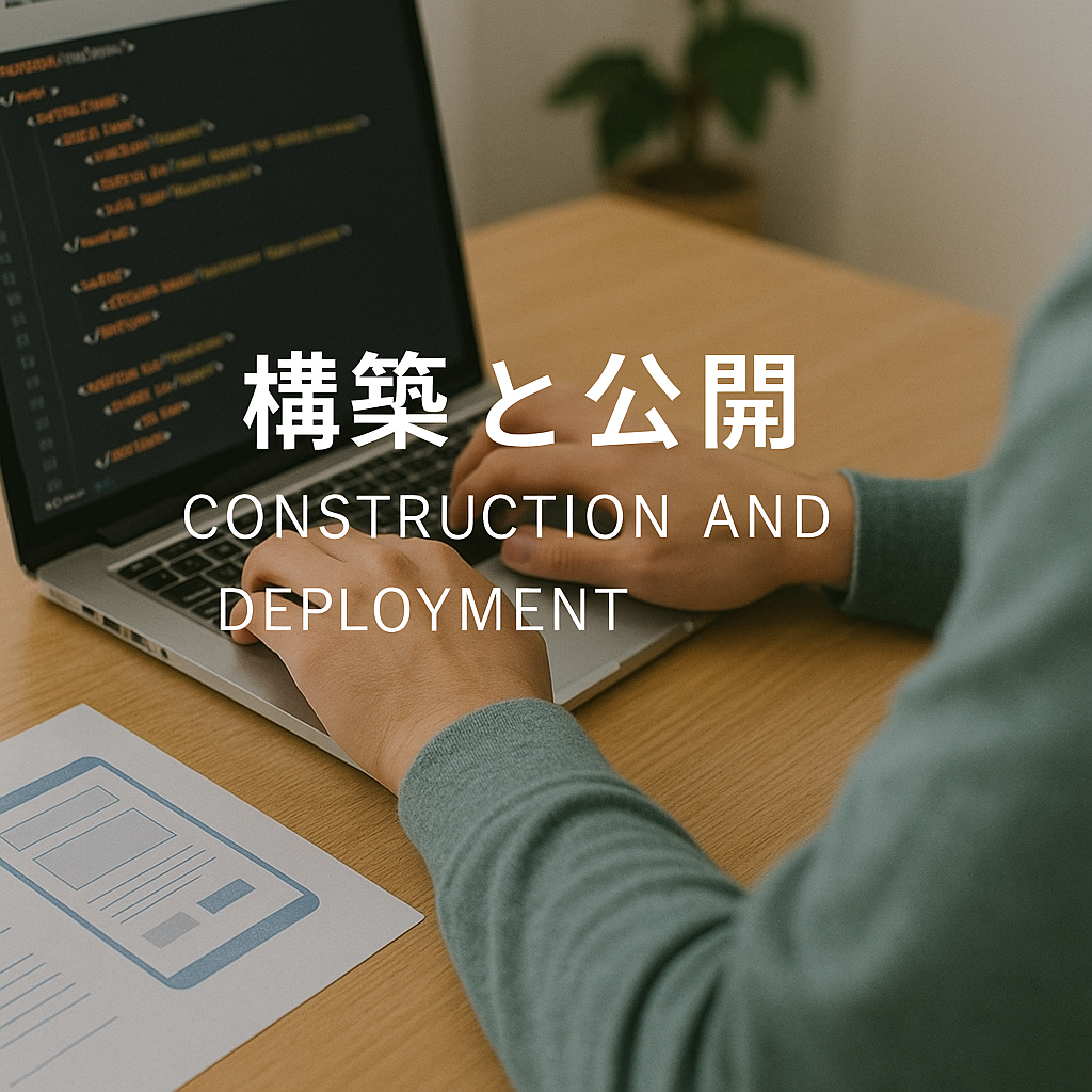
【初心者向け】パンくずリスト構造化データの作り方と実装例|SEO効果を高める完全ガイド
パンくずリストの構造化データを正しく設定すると、検索結果に階層リンクが表示され、SEOに効果的です。初心者向けに、HTML・JSON-LD両方の実装方法をわかりやすく解説します。


Simple Design, Gentle Code.
やさしいデザインと、伝わるコード。
温もりを感じるデザインと、見る人に寄り添う言葉。
誰が見てもわかりやすく、使いやすいホームページを。
そんな想いで、ひとつひとつ丁寧に制作しています。
小さな店舗や個人の活動を中心に、
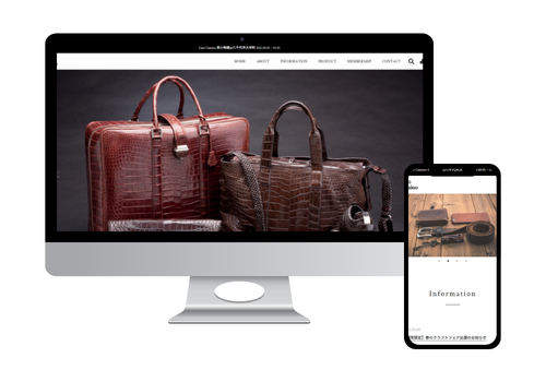
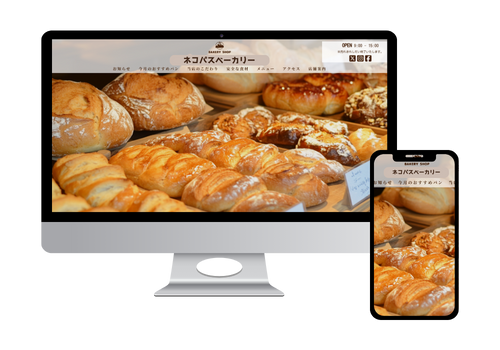
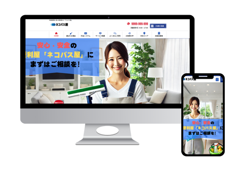
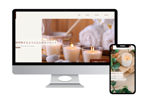
デザインから構築まで、見る人に寄り添うホームページを制作しています。
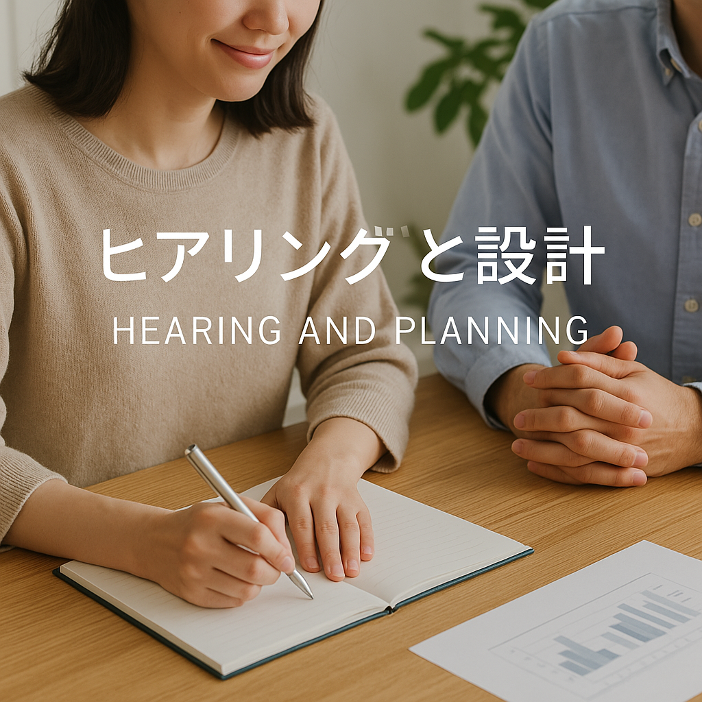
お客様の目的や想いを丁寧にヒアリングし、サイト構成やデザインの方向性を一緒に考えます。
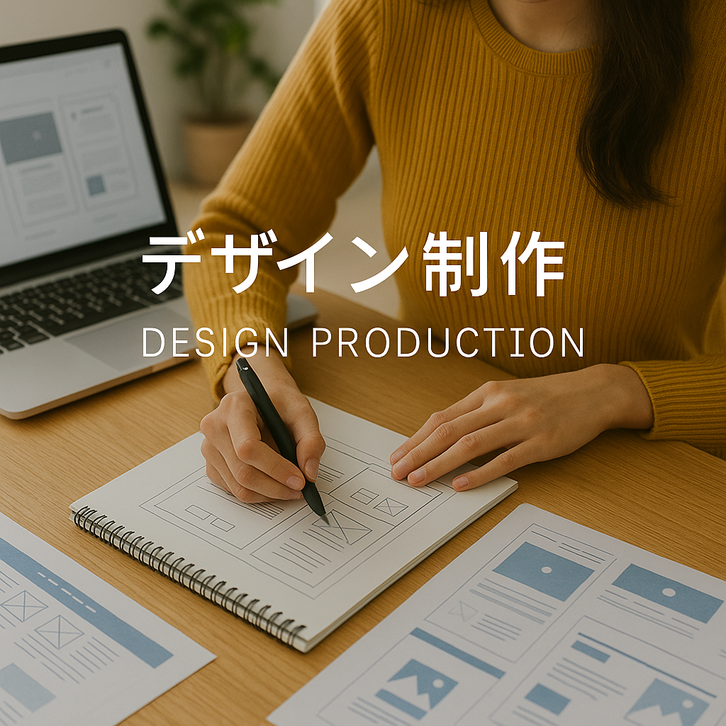
やさしく親しみやすいデザインで、見る人に安心感を与えるホームページを提案します。
スマートフォン対応やSEOも考慮し、正確で軽いコードで丁寧に構築します。
お客様一人ひとりの想いを大切に、
デザインから構築まで丁寧に制作しています。
現在、ホームページ制作サービスの
新規のご依頼受付を一時停止しております。
再開準備が整い次第、当ページにてご案内いたします。
月額¥5,000〜
毎月の負担を抑えながら、
ホームページを気軽に持てるプラン。
更新や運用サポートも含む予定です。
制作費¥〇〇〇,〇〇〇〜
デザイン〜構築まで一度の費用で完結。
少人数のクリエイティブチームで
丁寧に制作します。
制作費¥〇〇,〇〇〇〜
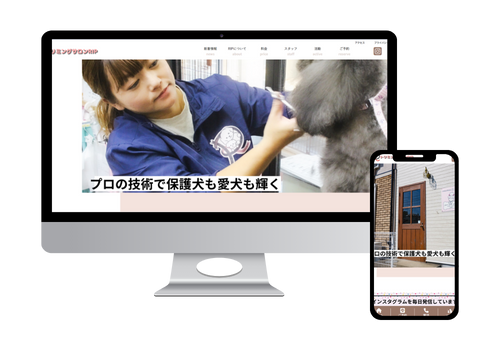
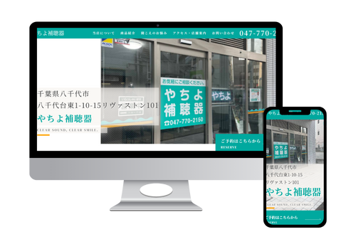
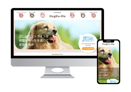
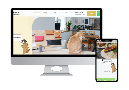
飲食店・サロン・個人活動などに向けた
小規模ページの制作プランも
ご用意予定です。
※現在は制作サービス準備中のため、料金のご案内のみ掲載しています。
※ご相談やご質問は お問い合わせフォーム よりお気軽にご連絡ください。
Web制作の知識やデザインの工夫など、制作を通して学んだことをわかりやすくまとめています。
これからWebサイトを作りたい方や、学びたい方に役立つ情報を発信しています。
パンくずリストの構造化データを正しく設定すると、検索結果に階層リンクが表示され、SEOに効果的です。初心者向けに、HTML・JSON-LD両方の実装方法をわかりやすく解説します。
ボタンに「押されたような動き」を付ける方法を初心者向けにわかりやすく解説。沈む・へこむ・凹凸が変化する3つの基本エフェクトと、実際に使えるCSSコード付きの実装ガイド。押下表現の作り方を確実に理解できます。
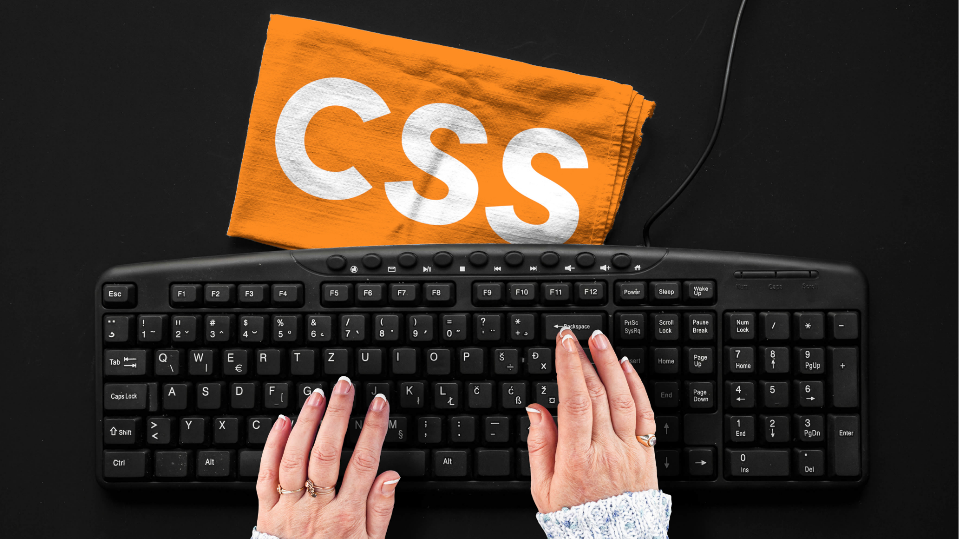
CSSの:hover(ホバー)とは何か、どんな時に使うのか、初心者でも理解しやすい基礎から応用の書き方までをまとめて解説。実践で使えるサンプルコード付きの完全ガイド。
CSSの擬似クラス「:hover」以外にどんな種類があるのか、初心者でも理解しやすいように解説。:focus・:active・:visited など主要擬似クラスの役割や使用例、実践で使える応用テクニックまでをまとめた完全ガイドです。

ファビコンとは何か、SEOにも影響するのか、そして初心者でも失敗しないICOファイルの正しい作り方と設定方法を徹底解説。PNGから全サイズ入りICOを生成できるおすすめサービス3選と具体的な使用手順もまとめた完全ガイドです。
Googleサーチコンソールとは何か、初心者でも理解できるように基本機能・使い方・見るべき指標・設定方法を詳しく解説。SEO改善に役立つ特筆ポイントもまとめた完全ガイドです。
千葉県八千代市を拠点に、個人や小さなお店のホームページ制作を行っています。
「やさしいデザインと、伝わるコード」を大切に、
見る人にも、使う人にもやさしいWebサイトづくりを心がけています。
現在は就労継続支援B型事業所を利用しながら制作実務と発信活動の両方に取り組んでいます。